Brat Font Generator
Acid lime, lowercase, slightly out of focus. The deliberately low-effort album aesthetic.
By Fontique EditorialPublished
The brat album font became the most copied graphic of 2024 by doing almost nothing: one flat acid-green square, one word in lowercase narrow sans, slightly blurred as if the file had been saved too many times. That refusal to look designed is the whole point, and it is also what makes it hard to recreate by hand, because every instinct tells you to sharpen it.
The Fontique brat font generator renders your own word in that language. Acid Green is the signature treatment: lime field, condensed lowercase, soft defocus. Inverted Black flips it to a black field with lime type, Blurred Print pushes the low-resolution artefacts further, Club Flyer stretches the letters into tall condensed capitals for a rave-poster feel, and Sticker Cutout turns the word into a die-cut lime sticker with a white border.
This is a fan-made tool. We do not host the original typeface or reproduce any album artwork, and you receive an image of your own text rather than a font file. As a lime green text generator it is deliberately narrow — one colour, one case, one mood — and that restraint is the whole appeal. Renders download as HD PNGs with a transparent option, which suits story posts, playlist covers, party invites, and merch mockups.
Sign in to generate — new accounts get free credits.
Type a word, choose a style and press Generate. Results appear here and in your creations.
- Models
- gpt-image-2 (Standard) · nano-banana-pro (Pro)
- Resolution
- 1K / 2K / 4K PNG, transparent optional
- Typical render
- ~45s Standard · ~22s Pro
- Credits
- 1 at 1K, 2 at 2K, 4 at 4K on Standard
- This page
- 5 presets · 6 sample phrases · 5 answered questions
- Credit packs
- From $4.90 for 100 credits · commercial use included
Fan-made interpretation: brat is the title of a copyrighted album and a trademark of its respective owner; Fontique is a fan-made tool and is not affiliated with, endorsed by, or sponsored by the rights holder.
Presets
5 Brat Font presets
Each preset changes material, lighting and backdrop while keeping "brat" perfectly legible.
Acid Green
lowercase condensed sans type centred on a flat acid lime field, uniformly soft defocus, no drop shadow, aggressively plain
Inverted Black
lime green lowercase type on a flat matte black field, same soft blur, high contrast and colder
Blurred Print
heavier gaussian blur with visible low-resolution compression artefacts and slight colour banding around the letters
Club Flyer
tall stretched condensed capitals filling the frame, harsh lime on black, photocopied rave flyer grain
Sticker Cutout
die-cut sticker of the word in lime green with a thick white border and a crisp edge, sharp rather than blurred
Examples
Brat Font Generator examples
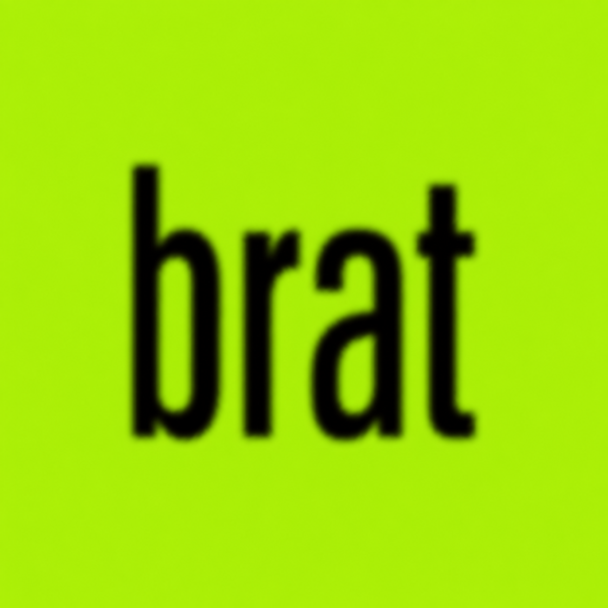
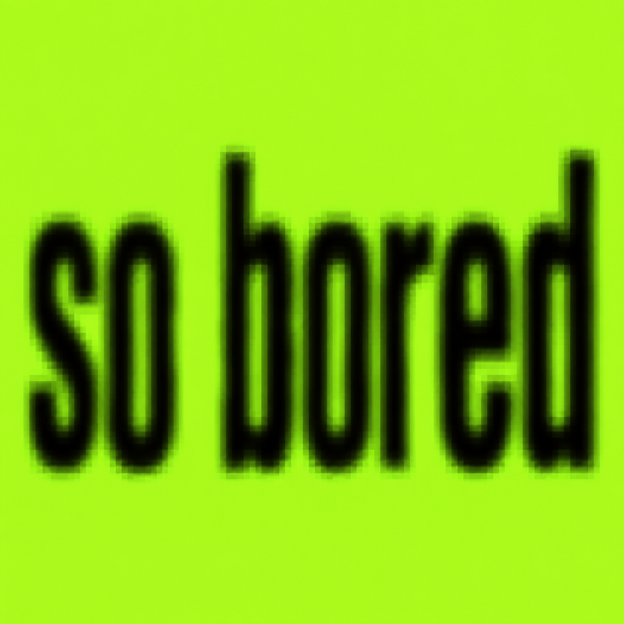
Straight out of the model — no retouching. Every render below came from the brat font generator with the preset named in the caption.

How it works
How to make Brat Text
- 01
Type one word, lowercase, exactly as you want it.
- 02
Pick Acid Green for the signature look, or Inverted Black.
- 03
Generate and download the HD or transparent PNG.
FAQ
Brat Font Generator FAQ
The cover uses a plain narrow grotesque sans in lowercase, deliberately chosen to look like a default rather than a design decision, then softened with a blur. Fontique does not distribute that typeface. This generator recreates the overall treatment — colour, case, blur, and framing — around your own word.
Because sharpness is what breaks the effect. The original reads as low-effort partly because it looks like a compressed screenshot rather than an export. Our presets bake that softness in; Sticker Cutout is the one option that stays crisp, for when you need the word to read cleanly over a photo.
Very close. The Acid Green preset targets the same high-chroma yellow-green range that made the original so recognisable on a phone screen. Because each render is drawn rather than sampled, expect small variation between generations, which is usually an advantage for avoiding a copy-paste look.
Your render is yours to use, and a lime green square with lowercase type is an aesthetic rather than a protected asset. Do not use the album name or artist name as branding, and do not sell merchandise that implies an official connection, since those names are trademarks of their owner.
Short is better and truer to the source. One word is ideal, two or three still works. Longer phrases force the type smaller, and once the letters shrink the blur swallows them. For a longer line, use Club Flyer, whose tall condensed capitals hold up at smaller sizes.
Sources
What this is based on
A letterform shape is not copyrightable in the United States, but the font file that draws it and the brand name that uses it can still be protected — so Fontique renders original lettering as images and never redistributes a typeface.
The following are examples of works not subject to copyright […] (e) Typeface as typeface.
- OpenAI, Image generation guide (gpt-image)
- Google, Gemini API — Image generation
Related styles
More pop-culture font generators
 Text effect
Y2K Font Generator
Millennium chrome, aqua gloss, glitter gel, and holo stickers. The year 2000 as a letterform.
 Font style
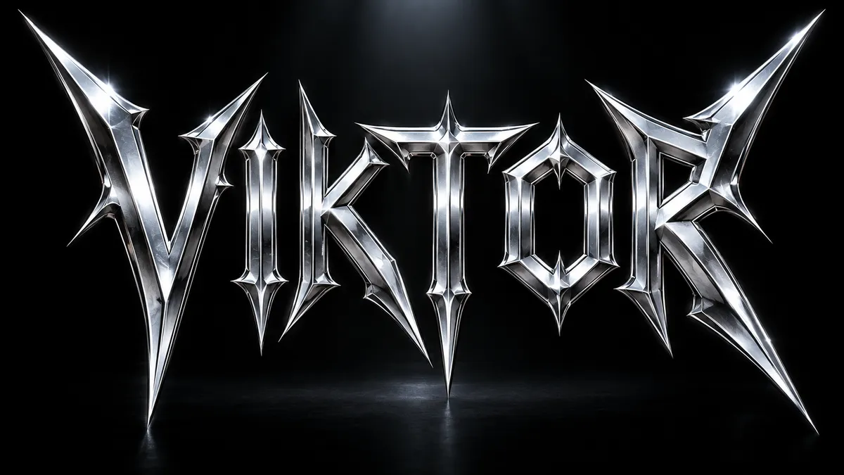
Metallica Font Generator
Spiked, angular thrash-metal lettering with chrome bevels and lightning edges. Fan-made, not affiliated.
 Font style
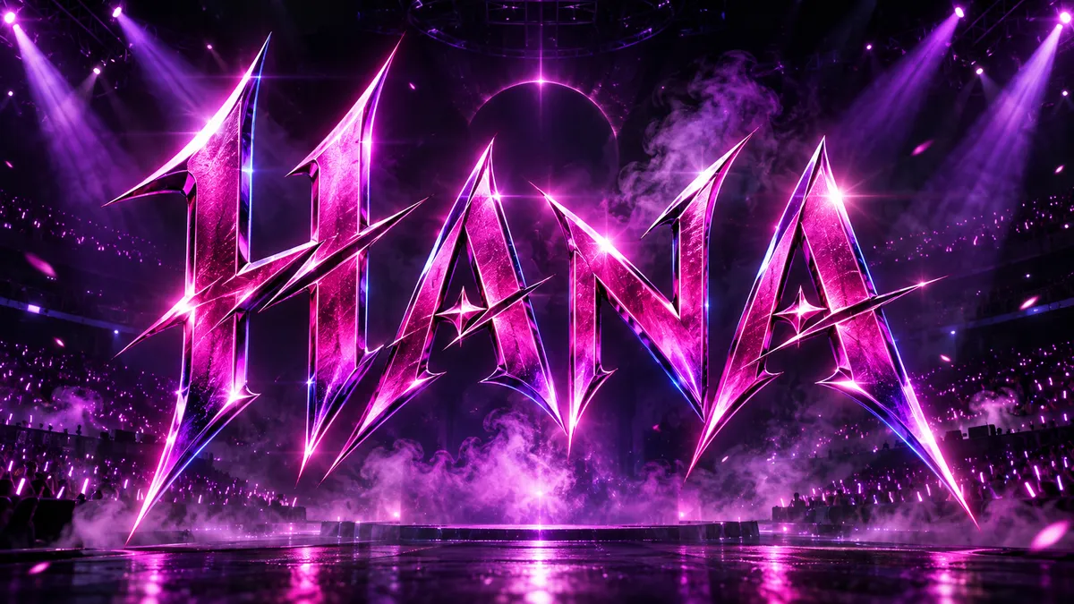
KPop Demon Hunters Font Generator
Blade-sharp idol-concert lettering in magenta, violet, and electric blue, inspired by the animated hit. Fan-made.
 Text effect
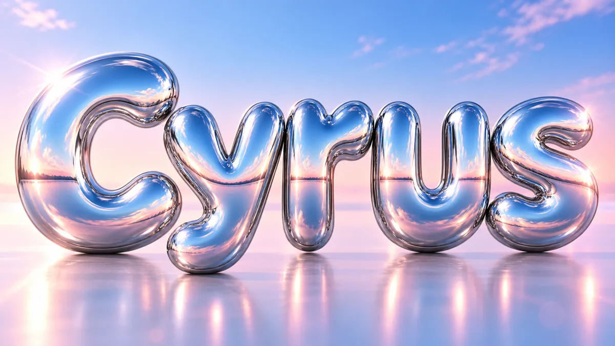
Chrome Font Generator
Mirror-finish liquid chrome that reflects everything around it. Y2K, beveled, or melting.
TikTok Font Generator
Thirteen TikTok fonts ordered by what actually survives the app, bold and italic first.
 Use case
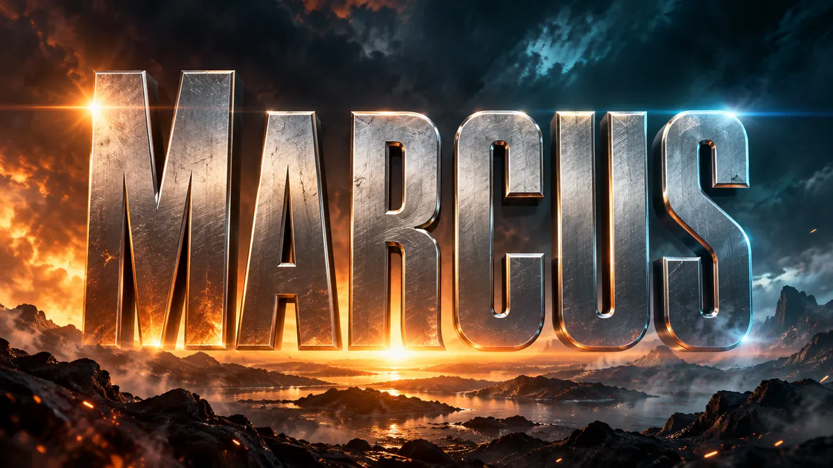
Movie Title Generator
Cinematic title cards and poster type in 16:9. Blockbuster, horror, sci-fi, or prestige drama.